Avatar components
Avatar components for modern applications: photos, initials on gray-200 or brand-50, gray placeholders, status indicators, verified badges, label groups, and overlapping groups - all in four sizes.
Avatar example
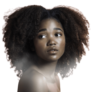 Design Teamdesign@adek.gov.ae
Installation
Copy the React component from this repository, or import it from the Angular library.
# React - copy the component into your project
# components/ui/Avatar.tsx from this repository, then:
import { Avatar } from "./components/Avatar";

# Angular - once adek-ui is installed:
import { AdekAvatar } from 'adek-ui';
Avatar examples
Below are examples and variations of the avatar component.
Photos
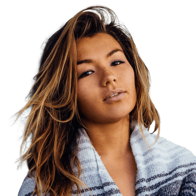
Photo avatars fill the same circular container - exported here from the ADEK Figma library. Fall back to initials, then the placeholder, when no photo exists.



Sizes
xs 24px, sm 32px, md 40px, lg 48px - initials in Montserrat Semibold, brand variant on brand-50 with brand-700 text.
Status indicator
A success-500 dot with a white ring shows online status; gray shows offline. Useful in messaging and directories.
ALVerified badge
A blue-500 check marks verified accounts - department-managed profiles and official channels.
ARPlaceholder
When no photo or initials are available, fall back to the gray silhouette on gray-50 with a subtle border.
Label group
Avatar with the user's name and a caption (email, handle, or role) - used in tables, menus, and headers.
Adil Rahman@adilGroup
Members of a project or thread: avatars overlap by 8px with a white ring; the final avatar carries the overflow count.
+5FAQs
How do I handle avatar photos that fail to load?
Render initials as the fallback, and the gray placeholder when neither a photo nor a name is available - the component falls through in that order so a broken image never shows.
Can I show a user's online status with the avatar?
Yes - pass status="online" or "offline". The dot scales with the avatar size and keeps its white ring so it reads on any background.
Can I add badges or indicators to avatars?
Status dots and the verified check are built in. For anything else (flags, company marks), position it inside the adek-avatar-wrap container the same way the built-ins do.
How do I make avatars different sizes?
Use the size prop: xs (24px), sm (32px), md (40px), or lg (48px). Initials and indicators scale proportionally.